Ranking MLB City Connect Uniforms
During the 2021 season Major League Baseball and Nike released new alternate jerseys as a part of the City Connect series. The jersey is created by Nike along with the MLB team to reflect the hometown for each team. Seven teams were given City Connect jerseys last season for the Arizona Diamondbacks, Boston Red Sox, Chicago Cubs, Chicago Whitesox, Los Angeles Dodgers, San Francisco Giants and Miami Marlins. The releases have continued this season with the Washington Nationals, Houston Astros and most recently Kansas City Royals being granted their own City Connect uniforms.
Below is my ranking of all 10 MLB City Connect uniforms from best to worst
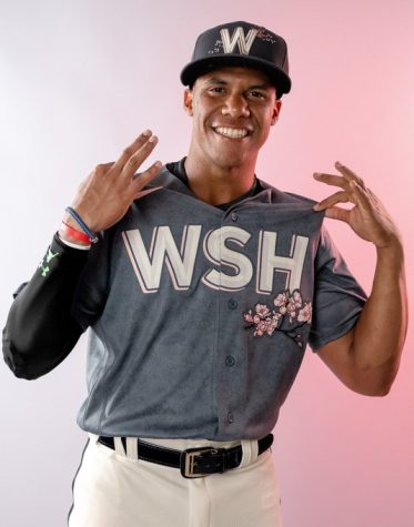
1.WASHINGTON NATIONALS: Spring in Washington D.C. makes you think of two things, baseball and cherry blossoms. The Nats City Connect utilizes the iconic cherry blossom as their color scheme with a branch across the front and on their hats. The D.C. flag is located on the side of the sleeve.
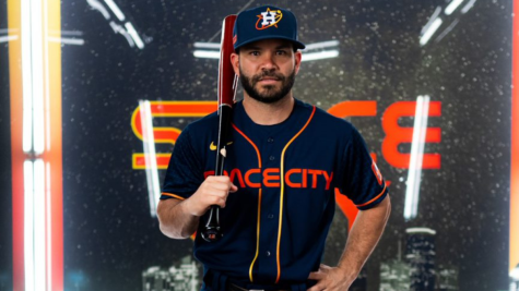
2.HOUSTON ASTROS: taking full advantage of being the home to NASA the Astros continued their space theme in their City Connect jersey. In NASA’s font “Space City” is written across the front. Star charts are shown on the sleeves of the jersey and the team’s color scheme from the 70s is used.
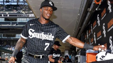
3.CHICAGO WHITESOX: Much like their cross town rival the Whitesox played into the region their team is based out of in Chicago. The word “Southside” is displayed across the front in a gothic font. The uniform color scheme goes back to the teams Turn Back the Clock uniforms.
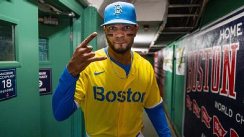
4.BOSTON RED SOX: The color scheme for the Red Sox City Connect is what throws people off with the team straying from their classic Navy and Red to using the bright blue and yellow that make up the Boston Marathon logo.
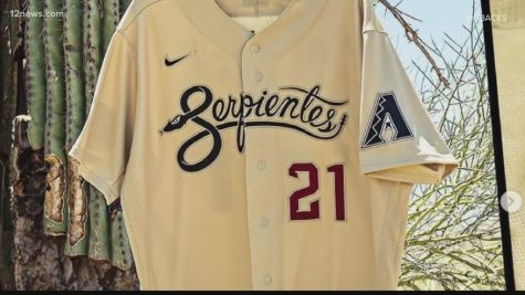
5.ARIZONA DIAMONDBACKS: The Diamondbacks City Connect plays on the team’s name, location, and hispanic culture by having “Serpientes” across the front with the “S” being a snake. The colors are the teams traditional colors using their Sedona Red as an accent color. The state flag is displayed on the side of the arm.
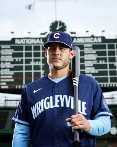
6.CHICAGO CUBS: Sticking to the colors of the Chicago flag the Cubs City Connect reflects the neighborhood just outside of their stadium “Wrigleyville”. On the one sleeve the Chicago River and the four stars that are on the city flag are represented. The Cubs City Connect jacket represents all 77 neighborhoods that make up the city of Chicago.
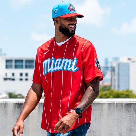
7.MIAMI MARLINS: The Marlins strayed from the classic Miami Vice theme and paid homage to the Sugar Kings, the Cincinnati Reds Triple A affiliate team that played in Cuba from the 40s to the 60s. They inverse the Sugar Kings colors by going with a red uniform with white stripes.
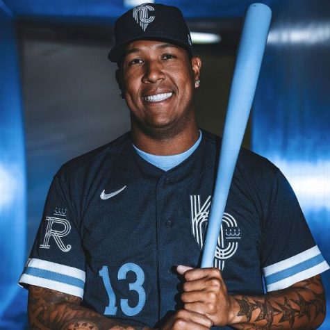
8.KANSAS CITY ROYALS: The Royals used the city’s fountains and art deco style to design their City Connect uniform. The usage of navy blue gives a nod to the team’s past uniforms. An intertiwned stipped KC is shown on the side of the uniform with a crown with the hats having the same logo.
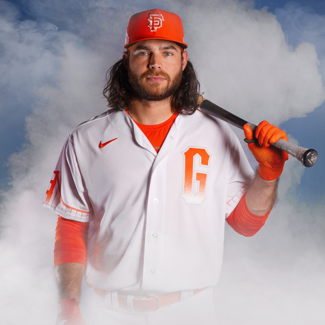
9.SAN FRANCISCO GIANTS: The fog in San Francisco served as the inspiration for the Giants CityConnect uniform. On the front of the jersey a “G” that begins a deep orange then slowly becomes white represents the fog typically seen under the Golden Gate Bridge which is also seen on their uniforms; decorating both sleeves.
10.LOS ANGELES DODGERS: The Dodgers stuck to their normal color scheme of dodger blue, white and red on their City Connect uniform. The team plays on the hispanic culture in LA by having “Los Dodgers” across the front and on their hats.


Lizzie is a senior and in her third and final year writing for The Paw. Lizzie loves all things sports: watching them, playing them and especially writing...
